Świetne spostrzeżenia treningowe zaczynają się od świetnej prezentacji danych. Najlepsze aplikacje fitness nie tylko zbierają liczby - przekształcają je w przejrzyste, przydatne historie, które pomagają użytkownikom trenować mądrzej, zapobiegać kontuzjom i zachować motywację.
Poniżej znajduje się ukierunkowany, oparty na projektowaniu przewodnik po tym, co powinny zawierać NAJLEPSZE spostrzeżenia i wykresy dotyczące danych treningowych, dlaczego każdy element ma znaczenie oraz praktyczne przykłady ich prezentacji.
Jak działa wgląd w dane treningowe Fito?
- Zasady doskonałej wizualizacji fitness
- Przejrzystość przede wszystkim: pokaż jeden najważniejszy wniosek na wykresie. Unikaj hałaśliwych osi, zbędnych etykiet i konkurujących ze sobą skal kolorów.
- Możliwość działania: każda wizualizacja powinna sugerować kolejny krok (np. "przenieś treningi na rano", "wymień buty", "dodaj dzień odpoczynku").
- Widoki w wielu skalach: umożliwiają natychmiastowe przełączanie między dziennymi, tygodniowymi, miesięcznymi i rocznymi ramami czasowymi w celu ujawnienia zarówno krótkoterminowych wzorców, jak i długoterminowych trendów.
- Podstawowe wskaźniki do wizualizacji
- Czas treningu (minuty na sesję, łącznie na tydzień/miesiąc/rok)
- Spalone kalorie (na sesję i łącznie)
- Kroki (dzienne sumy i linie trendu)
- Dystans i tempo (bieganie, jazda na rowerze)
- Strefy tętna i czas w strefie
- Gęstość tras i wydajność segmentów
- Wyniki dotyczące snu i wskaźniki regeneracji
- Ekspozycja na światło słoneczne i czas spędzany na zewnątrz
- Obciążenie treningowe i stosunek obciążenia ostrego do przewlekłego (w celu zapobiegania urazom)
- Najlepsze typy wykresów i kiedy ich używać
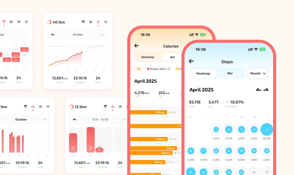
- Wykresy liniowe szeregów czasowych: idealne do trendów tempa, kalorii, kroków, wyników snu. Użyj wygładzania (średniej ruchomej), aby ujawnić trend bez maskowania zmienności.
- Wykresy słupkowe: pokazują skład minut treningu według rodzaju aktywności (np. bieganie vs siła) w ciągu tygodni lub miesięcy.
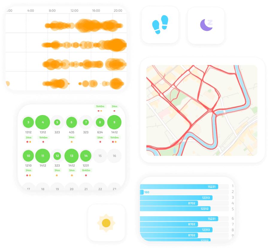
- Mapy cieplne (czasowe): wizualizują częstotliwość i czas trwania treningu według dnia tygodnia/godziny lub miesiąca/dnia. Heatmapy natychmiast ujawniają spójność i idealne okna treningowe.
- Mapy cieplne tras: nakładają na siebie wszystkie śledzone trasy w wybranym okresie, aby ujawnić ulubione segmenty i gęstość zasięgu.
- Wykresy bąbelkowe: kodują trzy wymiary (pora dnia, dzień tygodnia, czas trwania sesji) na mapie czasu treningu - większe bąbelki = dłuższe sesje.
- Innowacyjne, wartościowe wizualizacje
- Mapa cieplna czasu treningu (siatka bąbelkowa)
- Układ: dni tygodnia na jednej osi, godziny dnia na drugiej (lub miesiące a godziny dnia).
- Kodowanie: rozmiar bąbelka = łączny czas trwania sesji w danym slocie; kolor = średnia intensywność lub strefa tętna.
- Zastosowanie: identyfikacja "godzin mocy", luk i możliwości budowania nawyków.
- Mapa cieplna trasy (skumulowana nakładka szlaku)
- Układ: nakładka na mapę pokazująca gęstość śladów GPS w wybranym okresie (miesiąc/rok).
- Kodowanie: jaśniejsze/cieplejsze kolory dla często używanych segmentów; zanikanie dla mniej używanych ścieżek.
- Wartość emocjonalna: wywołuje "ślad na całe życie" i pomaga wybrać powtarzalne segmenty szkoleniowe.
- Time-in-Zone Sankey lub Stacked Area
- Pokaż, jak czas rozkłada się w strefach tętna na sesję lub tygodniowo. Przepływy podobne do Sankey mogą pokazywać zmiany w ciągu tygodni (więcej czasu w strefie 4 w tym miesiącu niż w poprzednim).
- Skorelowane panele wieloosiowe
- Przykład: górny panel = dzienne minuty treningu (słupek), środkowy = minuty światła słonecznego (linia), dolny = wynik snu (obszar). Zsynchronizowana oś x pokazuje wizualnie, jak poruszają się one razem.
- Rocznie / Miesięcznie "Mgła świata" Montaż
- Stylizowana mapa przedstawiająca miesięczne trasy z artystyczną obróbką - przydatna zarówno jako dane, jak i emocjonalny artefakt.
- Wzorce interakcji i UX, które sprawiają, że wykresy są użyteczne
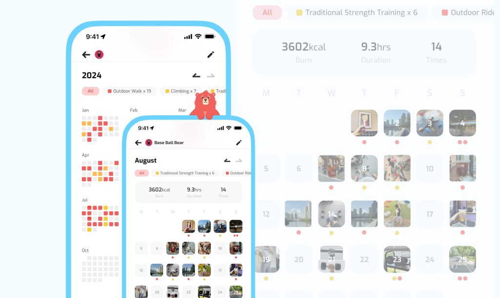
- Szczotkowanie i łączenie: wybierz zakres dat w kalendarzu, aby zaktualizować wszystkie wykresy i widoki map jednocześnie.
- Podpowiedzi i karty kontekstowe: najedź kursorem lub dotknij, aby wyświetlić podsumowanie sesji (miniatura trasy, kalorie, używany sprzęt, zdjęcie).
- Inteligentne porównania: umożliwiają szybkie porównanie dwóch okresów (w tym miesiącu i w zeszłym roku w tym samym miesiącu) z wyróżnionymi różnicami.
- Filtruj według tagu: natychmiast wyświetla wykresy przefiltrowane według określonego buta, trenera, siłowni lub rodzaju aktywności.
- Alerty progowe i zalecenia: wizualnie zaznaczaj, kiedy wskaźniki przekraczają krytyczne progi (np. obciążenie ostre:przewlekłe > 1,5) i sugeruj działania.
- Szczegóły projektu, które poprawiają zrozumienie
- Używaj jednolitych percepcyjnie palet kolorów i utrzymuj spójne znaczenie kolorów na wykresach (np. bieganie = czerwony, jazda na rowerze = zielony).
- Ogranicz serie na wykresie, aby uniknąć bałaganu; oferuj małe i liczne alternatywy dla porównań wielu kategorii.
- Zapewnij dostępne warianty: palety o wysokim kontraście, większe czcionki i wyraźne alternatywy legend dla czytników ekranu.
- Używaj subtelnych animacji, aby pokazać zmiany bez rozpraszania uwagi - np. płynne przejście podczas zmiany zakresów czasowych.